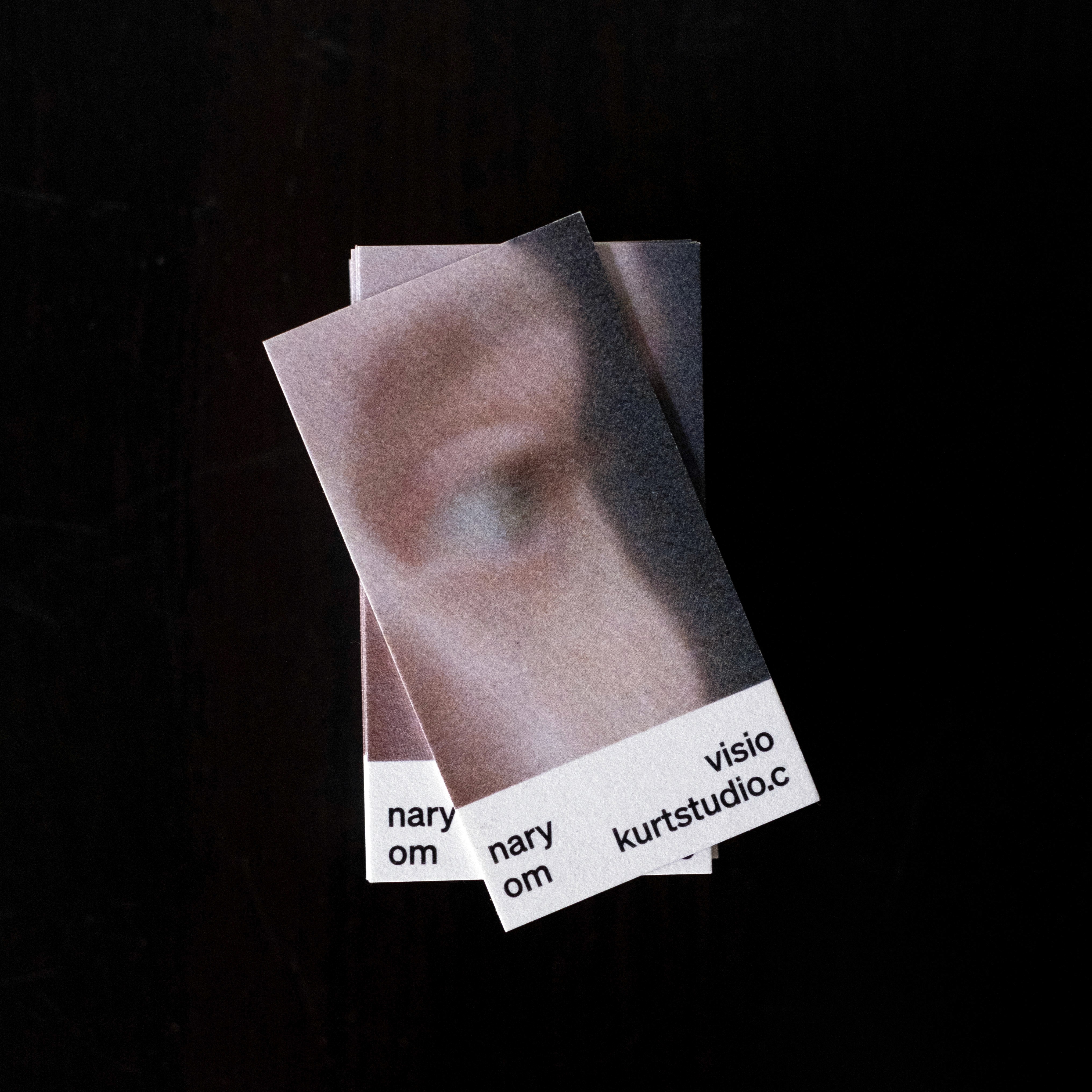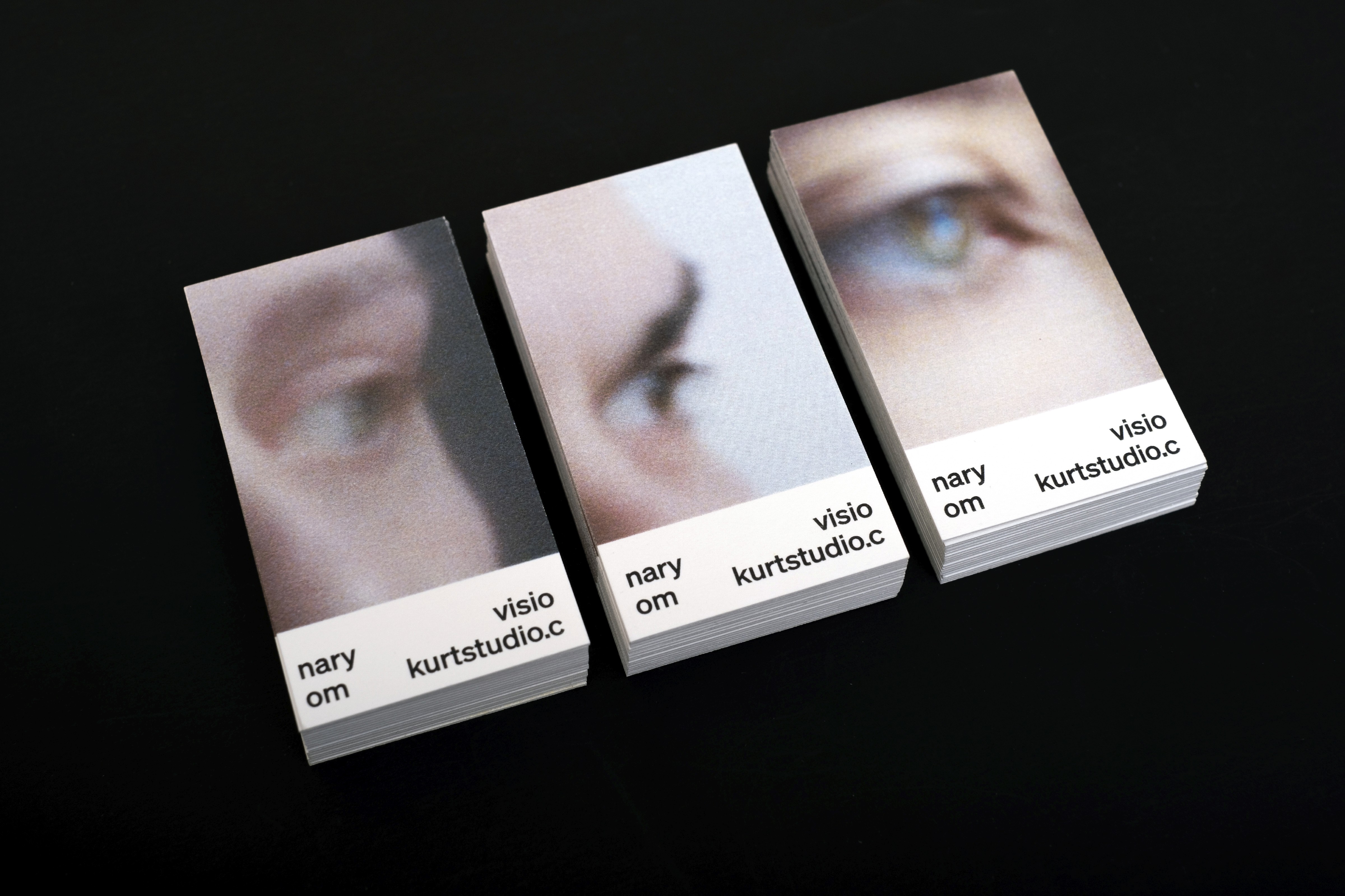
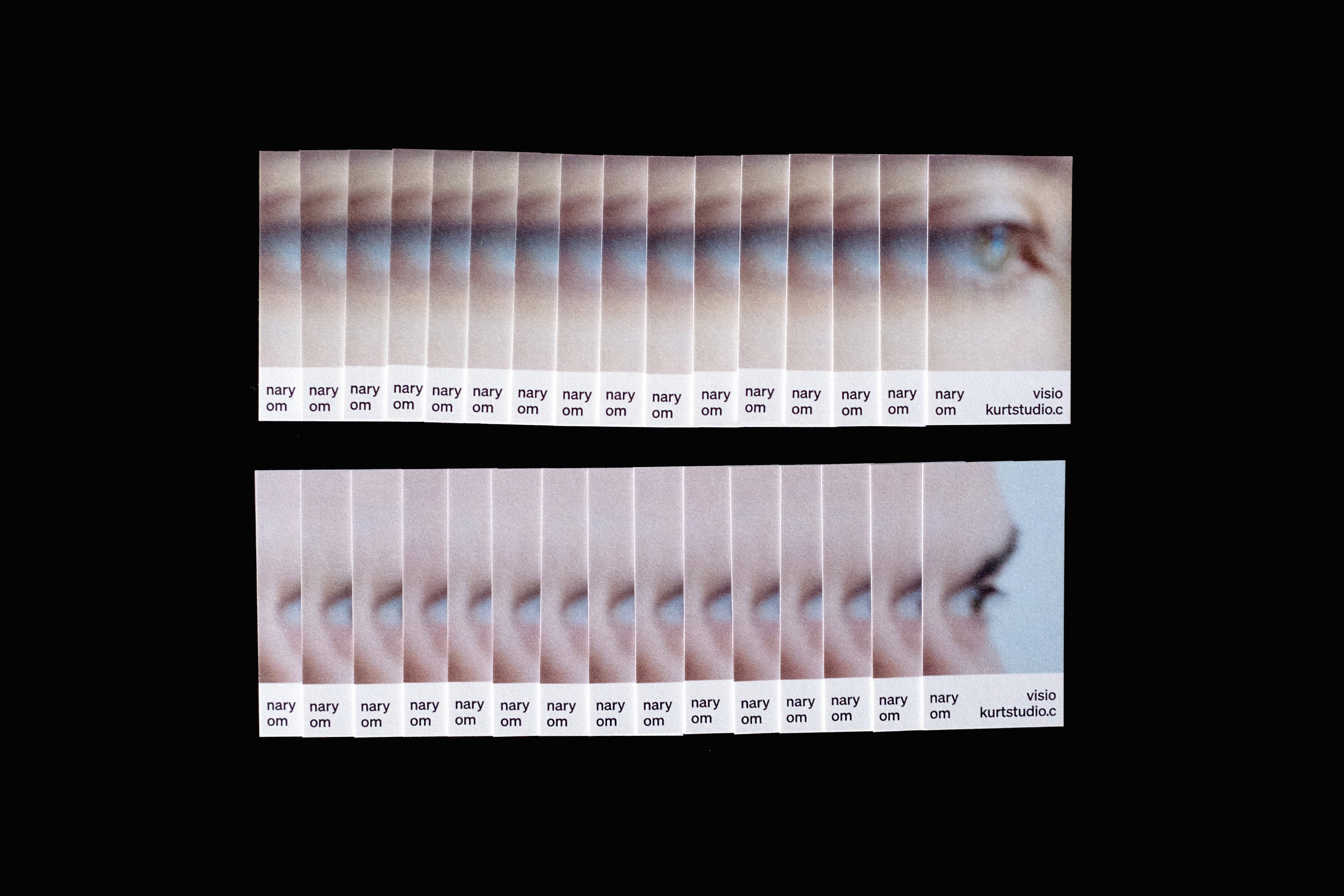
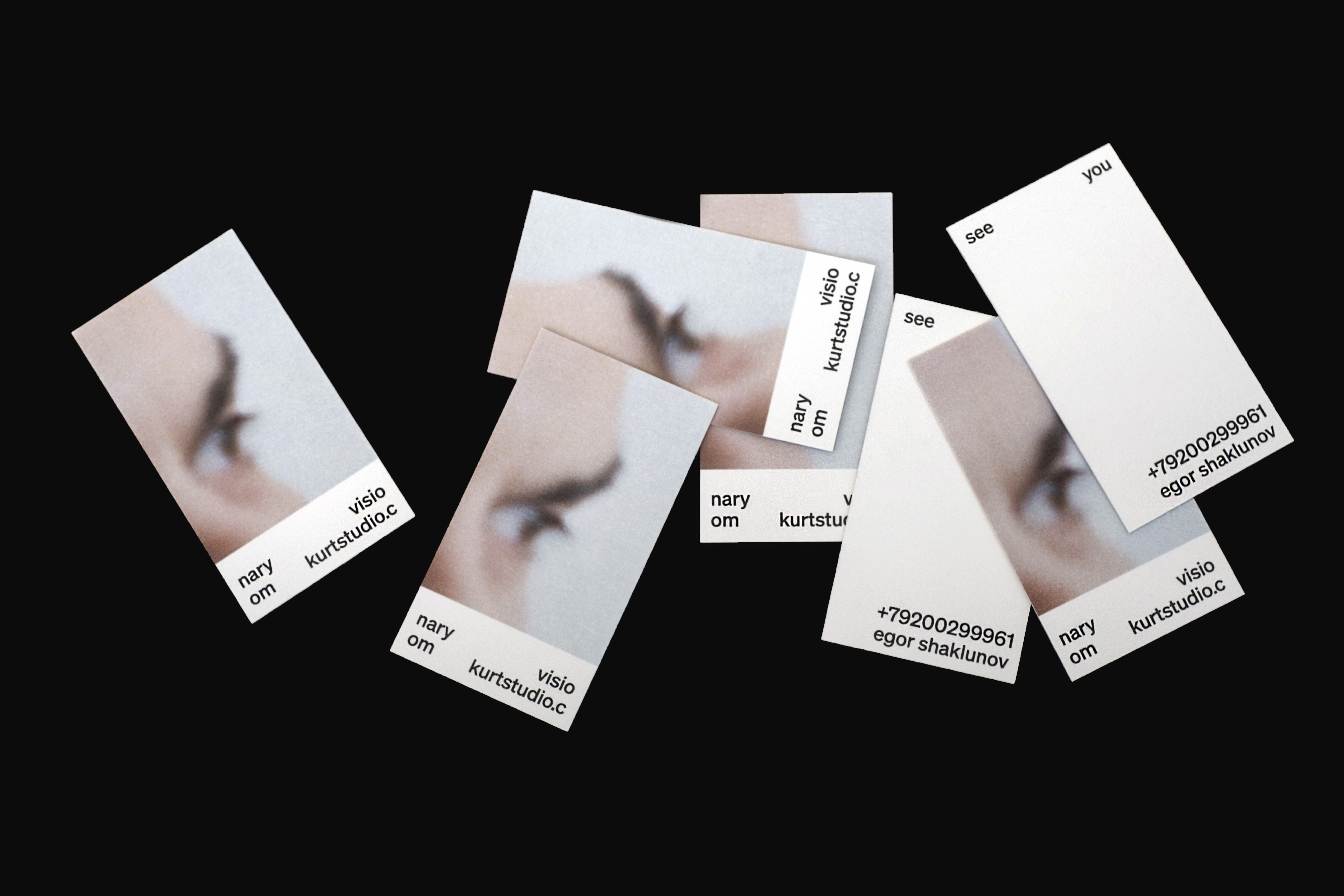
The core idea behind "Visionary" was to convey our studio's distinctive approach and creative vision through a tangible and memorable medium: our business cards. We understood that these cards would serve as the first point of contact for potential clients, collaborators, and peers, making it imperative that they encapsulated who we were as a studio.
Client
Kurt
2020
Contribution
Visual identity
Photography
Team - Kurt
Roman Shtein, Jenya Shtein
Egor Shaklunov
Inspiration
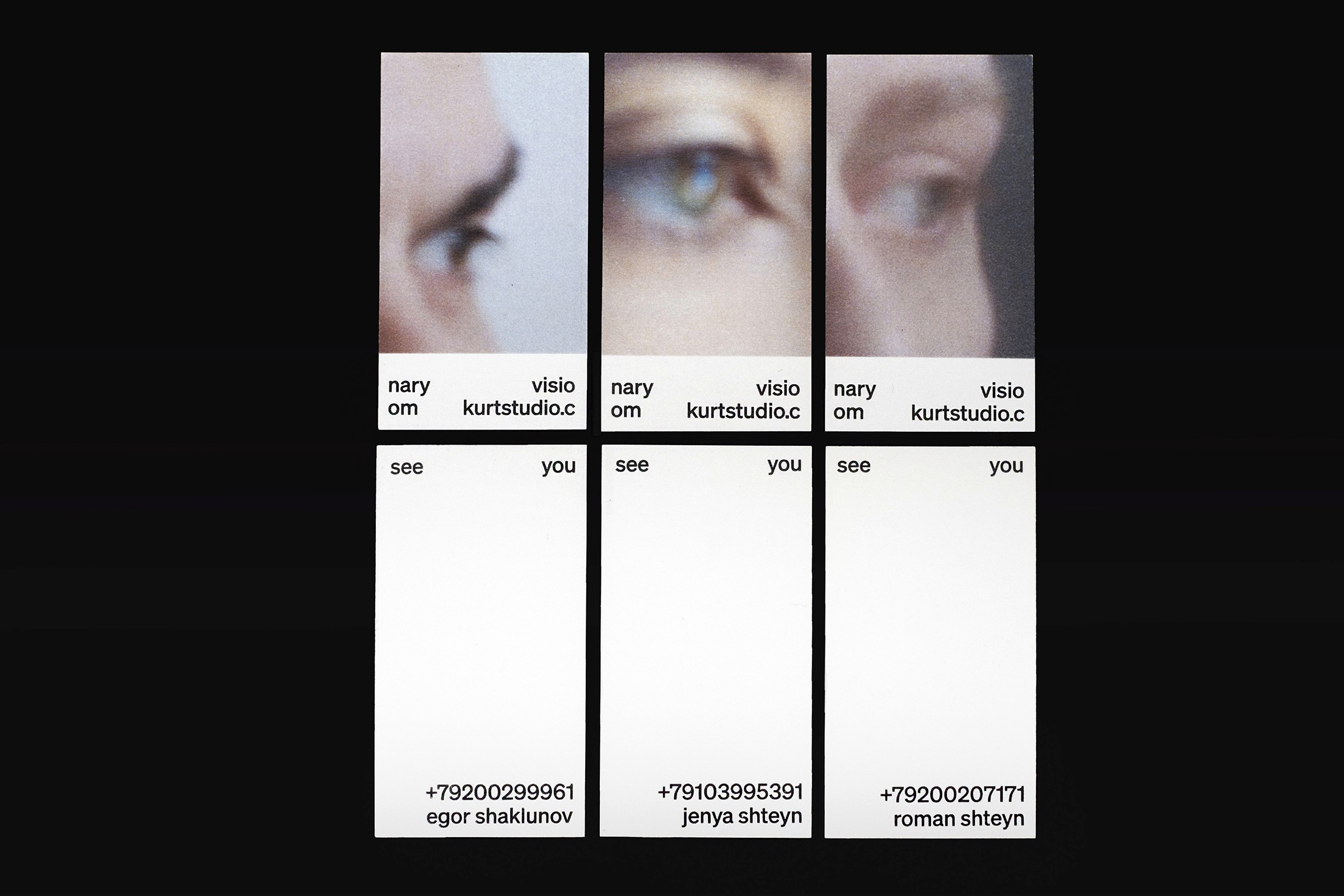
The layout of the business cards was carefully designed, with a focus on capturing the essence of our team's vision. We utilized enlarged fragments of film frames, an artistic nod to our passion for storytelling and visual communication. These fragments showcased the intricate details, textures, and moments of the filmmaking process, all of which paralleled our dedication to the art of design.
Execution
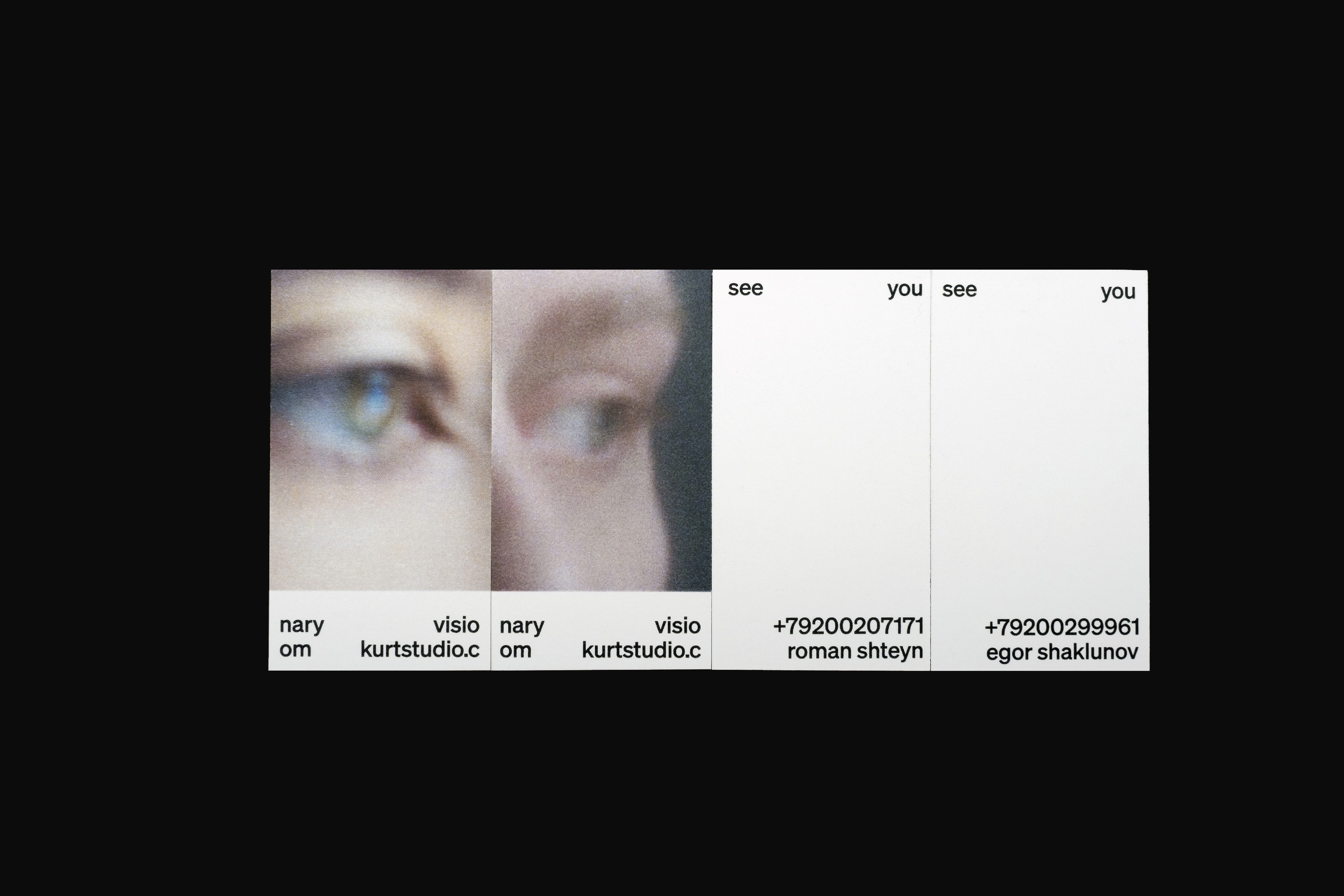
The centerpiece of our "Visionary" business cards, however, was the eyes of our team members. Each card featured close-up photographs of our eyes, highlighting our unique perspectives and the windows to our creative souls. This choice not only made the cards visually captivating but also underlined our commitment to perceiving the world through an imaginative lens.
Furthermore, we leveraged typography as a powerful design element. Typography was strategically placed on different levels and sides of the cards, creating a sense of depth and interaction that echoed our multidimensional approach to design. It reinforced the idea that our studio was not just about what you saw on the surface but also the layers of creativity and insight beneath.
In the end, "Visionary" became more than just business cards; it was a tactile representation of Studio Kurt's ethos, creative energy, and our unwavering commitment to innovative design solutions. These cards served as an introduction to our studio's culture and vision, leaving a lasting impression on those who had the privilege of receiving one.
Scope of work
INTERVALS is a large-scale festival that takes place three days a year and is presented in the brightest and most unusual locations. We developed a printed map that easily helped to navigate through all the installations and locations of the city. As part of the work on visual communication, social media, navigation, website, uniforms and merch were worked out for both the team and guests.
